National Award Winning KCACTF. Click link to see listing in Stage Direction Magazine.

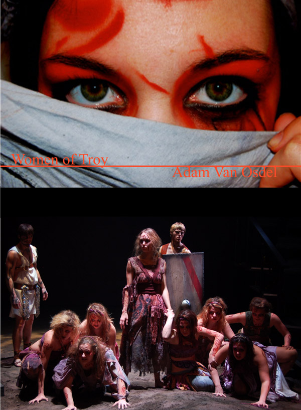
Below: Winning Competition Board. Displays concept to final stage design. Click the picture to see some process shots.
Women Of Troy: Concept Review
Make Up Women Of troy
(A reflection of destroyed oppressed cultured as viewed by the concurred)
The purpose of this project was to design cohesive makeup that will mesh with the idiom of Women of Troy as one collaborative force. This will engage the audience toward the ideological position of the director and design team. The motivation is to create a window into a post war culture as viewed from the conquered under the umbrella of pre-Christian tribal culture. Audiences who will use, be interested in, and/or be impacted by the design include: any who have ever taken part in the understanding of oppression and failure.
Major goals of the design include:
Create a lasting imagery of the scars and or brands placed on a conquered culture by the conqueror.
All design choices must mesh with designs of the Costume Designer, Set Designer, and Lighting Designer.
Follow the artistic direction of the director.
Allow process to be replicated for future use.
The primary constraints on the design are:
Make Up strong enough to withstand a heavy movement, physical contact, and dirt.
Dance based movement.
Cast of 14 all requiring full body makeup
2 hour prep time before show.
Creating stencils to allow for easy recreation of character based patterning.
Check for allergies to variety of makeup. Actors asked to submit any known allergies.
Special project needs or capabilities:
Tough reusable stencils.
Stencils that could match the contours of the body. i.e, face neck torso arms.
Stencils created from Hot Glue. Cut, Heated, Poured, Cooled, and cut to shape.
The project team consists of:
Fabrication - Make Designer.
Application – Make up Designer, 3 Assistants.
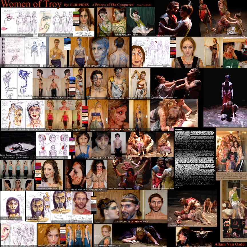
Concept Statement
The purpose of the makeup in Women of Troy was to represent every character in a full body of physically altering makeup that would allure the viewer to move under the guise of this other world of mythology, pain, destruction and loss. All designs had to fit under the outlined criteria of pre-Christian influenced Celtic culture as indicated by the director. Designs must flow with the concepts of the entire design team to allow for a strong overall motif. More directly on makeup: to create visual references for an audience.
These references would signify; in a more representational way, the hardship of the women, the strength of the soldiers, and the mysticism of the gods. Each of these aspects of makeup would hail to a localized theme that the character portrays in the piece. Color along with shape and pattern would become the facilitator of the characters arch type.
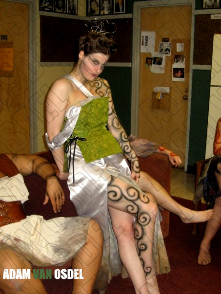
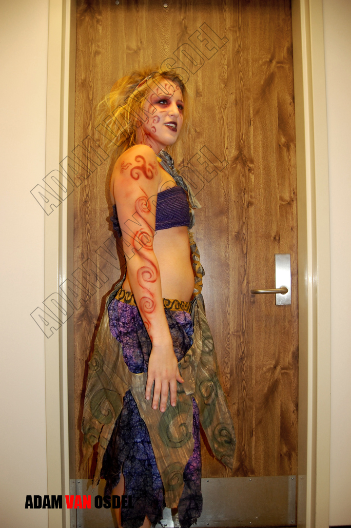
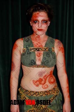
Sizzle goes the flesh as a hot brand is placed upon it; forever marking the skin, as the stench of burnt ruined flesh fills the air. In branding the branded is filled with white hot pain and a constant reminder of that moment. This was the motivation for the body art placed on the women. They were toppled and their loved ones killed. The once noble place they held in a prospering society was mutilated. Thus, with lips of dried blood, they become broken items to be placed on the mantel of their conquerors. Still they remain strong. This strength is reflected in strong lines and bold colors of red and purple. The dark eyeliner running down the faces of the women symbolize tears. The symbols their culture is burned into their skin as a mockery, shown as the Celtic swirls and the placement of the triple spiral used in Celtic graves and ritual.
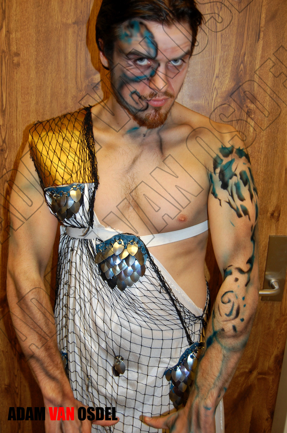
The Gods Athena and Poseidon had to hold another worldly power. Thus they were granted colors outside of such pain. With ocean blue and strong shadow Poseidon, god of earthquakes and sea, could be from that other world. He is also given a more intricate tattoo design to show his depth. Athena would receive marooned and blue fading back across the face with strong contrast to demonstrate strength. However both gods must descend to the level of the mortals. However no attempt was made to hide to the audience that they were gods hidden among men. Athena was granted cuts and branding to allow for blending with chorus.
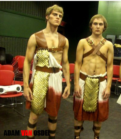
The conquerors would receive no color only the shadow they cast on the women. They were painted in black with an addition to mild tanning. Features were hardened and muscles accented (or added) to show years of battle. Any place bones met skin it was shadowed to give more depth. Strong like stone they had to reflect the same cold nature. They received no tattooing or body art. This lack of body symbols painted them as alien and foreign to the world of the women. They received no color because like the world they had drained of life they too must appear almost vampiric in nature.
The boy is the youngest of our characters and the remnants of the dead men. In a world once full of strong men he is the only male left. Thus he is a symbol of hope. His skin with its golden brown quality was left as it was. So that later when he is killed the hope and he himself can be drained. Only after his death do the spirals appear on his body as rigamortis veins indicating his joining to the act of defilement parallel to his cultures death.
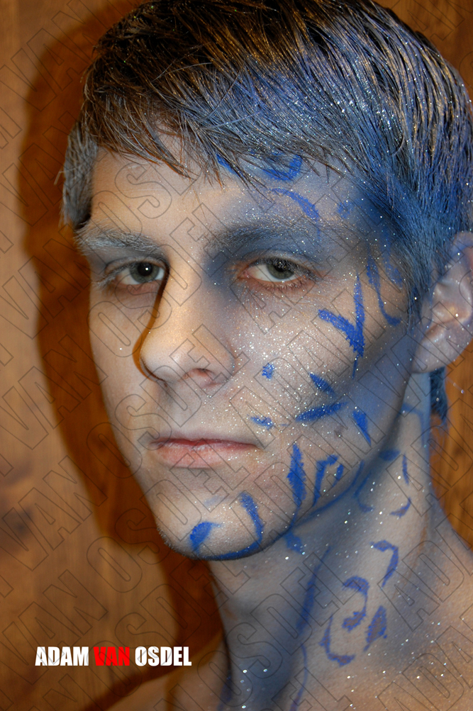
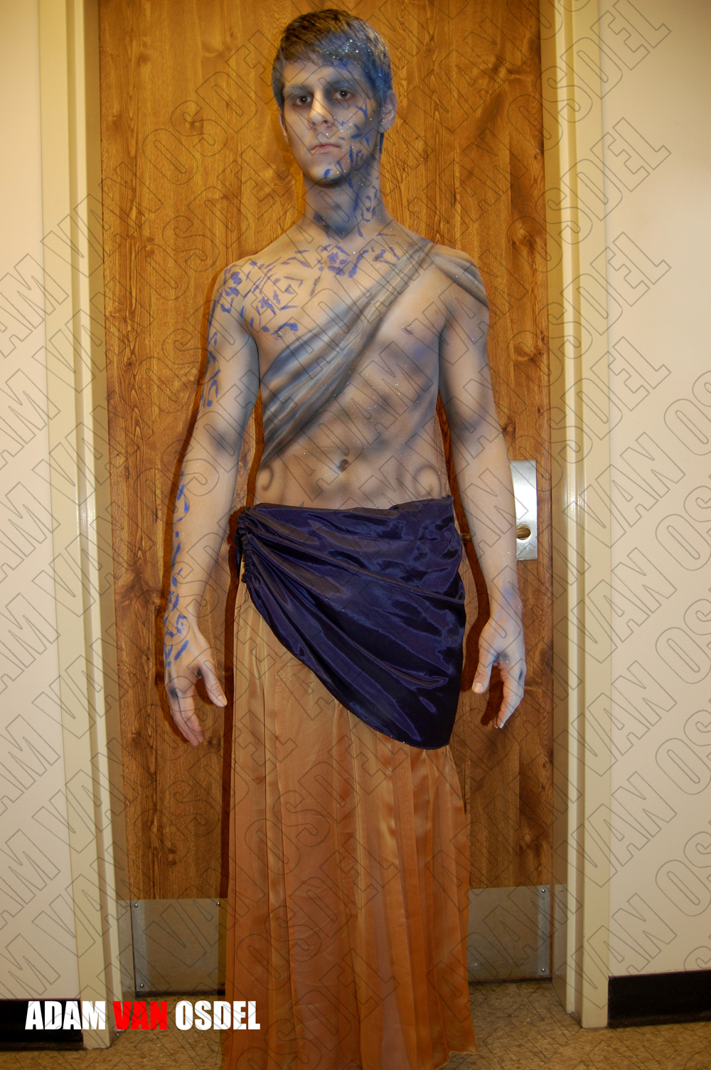
Priam is our strongest and is destroyed. His memory is all that remains. This memory is of a young and powerful Priam. Thus he is not aged but made to look only other worldly because in coming from death and dreams he is only presented in an idealized memory. Painted in cold blues and white with muscles added through shadow and highlight. He was allowed to glimmer like the memory with the addition of sparkle. These sparkles shook from his body in movement as if the memory of him was decaying. Because Priam is a shadow and nothing more, his sash would be like smoke on his body. Only present as a representation. His spine dotted with black and eyes sunken indicating decomposition. Lastly his tattoos broken and fragmented on his frame are no longer crisp but falling apart.
Helen our half god is still in a higher position and is less tortured was presented with unscathed completion and other worldly green. Her relations caused such travesty thus her makeup must indicate allure, and passion through the red lips. A green color scheme was chosen to demonstrate resentment. She being half god is granted the same depth that Athena and Poseidon are in color. However being mortal is almost marked by this half quality by an apparent mix that makes her unfitting to both worlds.
Overall the each character had to be represented by some aspect of there being. Whether it be physical or metaphysical both had to come across in the design and color choice of the character’s makeup and composition.
Thank You.